
Best eCommerce Landing Page Examples to Get Inspired
Table of Contents
Today, we present you with some of the best landing page examples in e-commerce. These examples will help you figure out why some landing pages convert and help you create your own. Design matters, after all. But they also have to have the correct elements used correctly for your landing page to convert.
Best Landing Page Design Practices
We’ve compiled a list of the best landing page examples for e-commerce sites. But before we take a look, let’s first review some of the most important practices for landing page design.
They focus on the goal. Good landing pages only have one goal: to inform and convert. Informing your audience not only entails the sharing of information but also prompting them to do an action. Converting, on the other hand, means you turn them from prospect to client. For this reason, landing pages do not contain many navigation options. They were made so visitors can perform an action according to your CTA, not to turn away.
They limit scrolling and navigation. As previously mentioned, landing pages do not have many options for navigation so audiences focus on your offer. Aside from that, it should have additional information about your offer including a CTA to optimize conversions.
They use relevant, engaging visuals. It’s an already well-known fact in design that images boost conversions. They break up long text and help catch your audience’s attention. Images that you add should be engaging and relevant as well as consistent with your brand.
They’re consistent with your brand. Your landing pages should be consistent with your brand – its style, colors, and design elements. It should be something that your audience instantly recognizes and associates with your brand.
They were made using F or Z patterns. Design landing page elements in an F or Z pattern. This is done to optimize the page for retention. According to research, people’s eyes typically move around a website in an F or Z pattern. Take advantage of this fact by placing important elements along these patterns.
Examples with Clear Headers
Your headline is one of the most important parts of your landing page. It serves as your first impression. If you get it right, your audience will read on and learn more about you and your product. But if you don’t, people may leave in a snap and not give you a chance to explain your products.
What makes a great header?
- Clear – offers no ambiguity in explaining the product or service.
- Relevant – the message matches the product introduced.
- Empathetic – addresses the problem of the visitor.
- Compelling – must be stated in a way that attracts the audience’s attention.
Dollar Shave Club
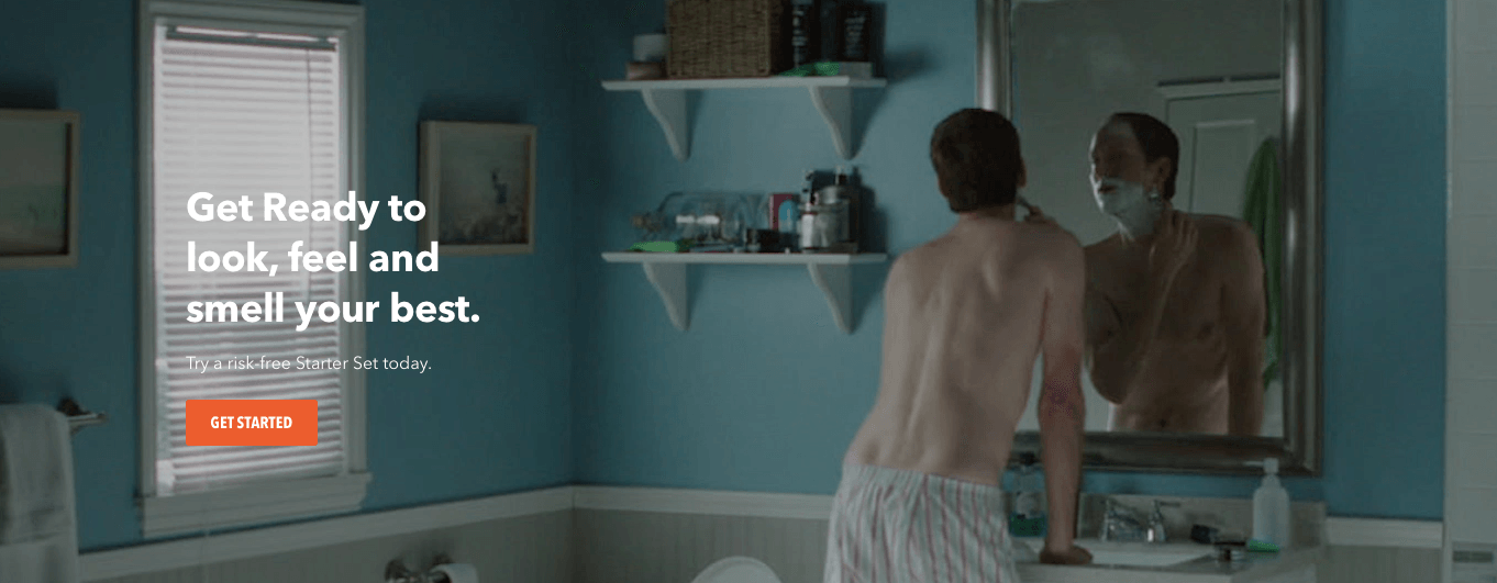
Dollar Shave Club immediately gets to work to showcase what they are offering and immediately follows up with an offer you just can’t refuse. It does a very good job of highlighting the problem they want to solve while also instilling a bit of curiosity with the product itself.
The video shown in the background features various people using their products in different ways. But they’re not focused on a particular demographic – it’s people from all walks of life. It sends a message that they are versatile.
Hello Fresh
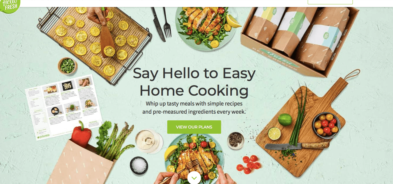
The makers of this landing page sure knew what they were doing. They were immediately able to communicate their authentic home-cooked food and recipes. On the other hand, it can also be improved by choosing a less distracting photo and by making the CTA stand out.
Examples with Great CTAs
You call to action determines what action you want your audience to take. It is your chance to motivate them to take action and take the next step to becoming a customer.
What makes a great CTA?
- Contains a statement that incites action but presents no real obligation
- Creates a sense of urgency that encourages action right away
Blue Apron
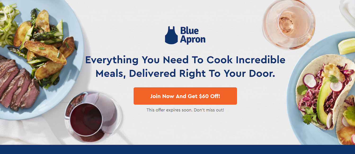
Blue Apron effectively communicates what they want their customers to do while also providing an incentive for joining. Right below the CTA is a statement that creates scarcity, enabling the user to act in a hurry. The color of the CTA button is also is in contrast with the color of the background, making it easy to spot.
Fabfitfun
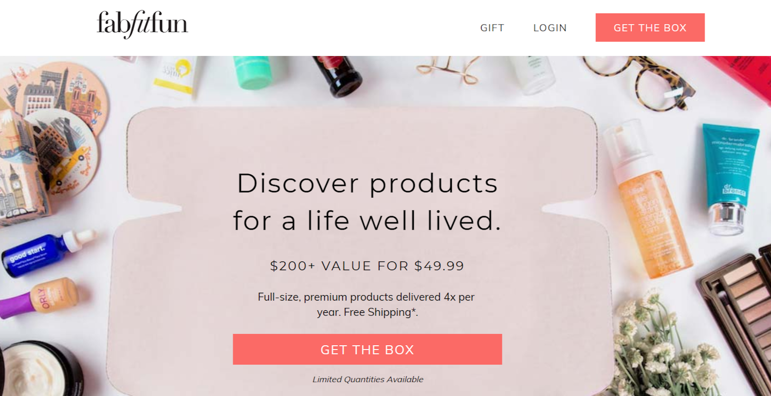
Fabfitfun is a great example of a landing page that has an excellent CTA. The page is well-designed with its high-quality images of items contained in their mystery box. Their use of colors adds a nice touch of design while making sure that the CTA button stays visible and prominent.
Examples with Amazing Social Proof
Social proof brings your business closer to your audience. Instead of being a faceless corporate entity, you now have a face and a voice. That’s why it’s important that you introduce an element of social proof into your landing page.
Why add social proof?
Essentially, social proof makes you believable in front of your audience. This is because you’re adding positive comments made by other people about you instead of self-serving promotional material.
What makes great social proof?
- Relatable – people want to see comments from people with whom they feel they can get the same results.
- Believable – use forms of social proof that are believable such as videos and interviews, not just those that contain first names of various people.
- Results-driven – aside from their personal preferences, people want to know that your products can deliver what they need.
Danielle World
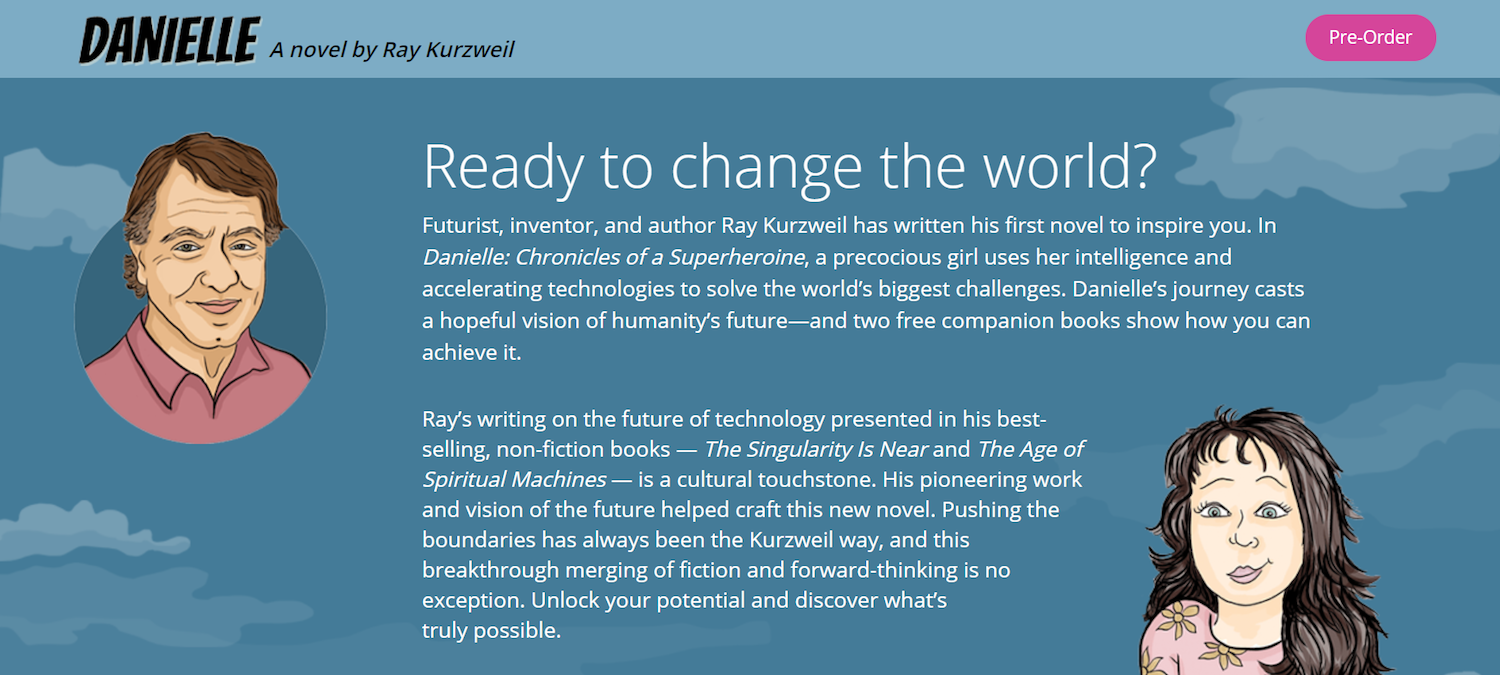
Danielle World brings us an example of a landing page that provides excellent social proof. They not only provide plenty of testimonials with sources from credible people, but they also share some testimonials and reviews from well-known celebrities such as Stevie Wonder, Tony Robbins, and Suzanne Somers.
Fabletics
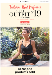
Fabletics does a pretty good job of leveraging social proof – however subtle. They do this by showing how many products they’ve already sold.
Examples that Highlight the Product Effectively
Poorly-made descriptions of products will only hurt your chances of conversion. Sure, you can wait for your audience to try your product on their own. But unless you explain your product and the results they bring effectively, you shouldn’t be expecting new customers soon.
Do you really need to explain the product?
Product descriptions are absolutely necessary. High-quality images without any descriptions will not get you anywhere. Effective product explanations stir curiosity and improve the chance of a sale.
MeUndies
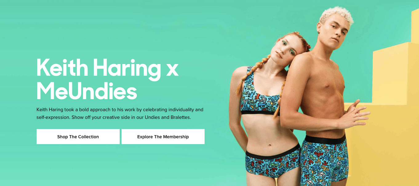
MeUndies effectively explains who they are and what their products are all about with this landing page example. However briefly, they manage to pique the interests of whoever is reading and entices them to buy their underwear.
Home Chef
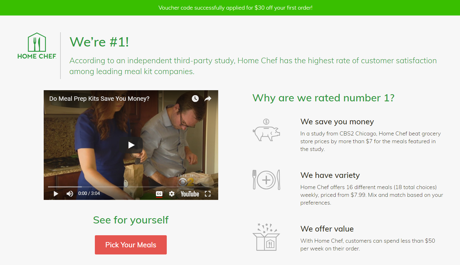
Home Chef is another example of a landing page that highlights the best things about the meals that they offer. While providing little information about the meals themselves, they still manage to spark interest and objectively show why customers are always satisfied.
Examples that Rely on Content Strategy
Your digital marketing strategy is what brought your customers to your landing page. So why not bring them further in using your content?
Can articles be good landing pages?
Of course, they can. One of its biggest advantages is that customers willing to read through all those content will have less need for guidance further along the funnel.
Quip
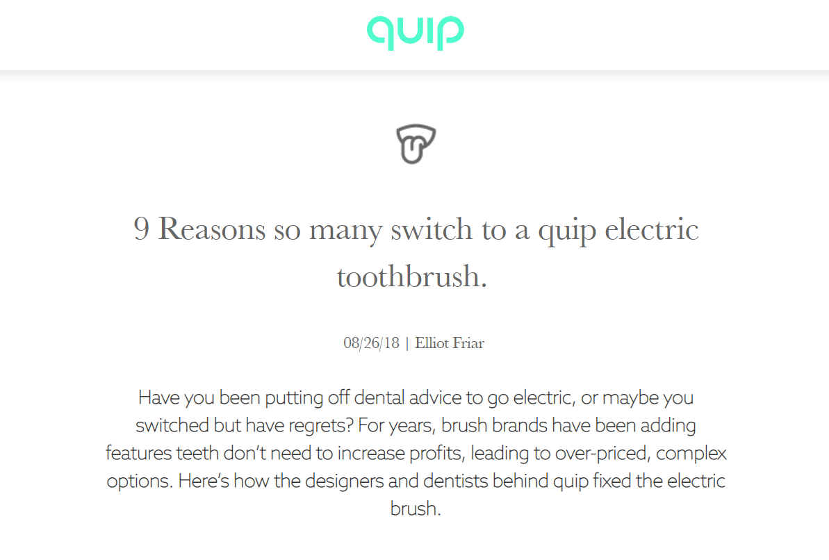
Quip is the perfect example of a landing page in the form of a blog post. It provides a comprehensive look at the product. It highlights the many advantages of using their product without it looking too sales-y.
DragDorp is the only editor universal to any CMS – Magento, Shopify, Lightspeed, WordPress, and others.
It can be used with any HTML editor to help you build pages visually.
It comes with 75+ ready Landing page templates you can use on any CMS!
Try it now for free, register here and publish your slideshow today:)

Leave a Reply
Want to join the discussion?Feel free to contribute!