7 Principles in Web Design that Boost Conversion
Table of Contents
Traverse the web, and you will find any number of tips and tricks designed to help web designers and small business develop a compelling website. And there is a strong reason for that because web design can boost conversion.
Here then, in no particular order, are the seven most important design principles that are likely to affect your conversion rates.
And while web design plugins like Dragdropr make designing your website a breeze, you still have to make decisions for yourself about the final layout, features, and style of your site. Given the extraordinary number of options you have when it comes to design, being able to identify the major categories of compelling and high converting web design is going to help you make better design choices.
1. Make Sure your Website is Truly Responsive
Given the amount of mobile browsing that is taking place today, anything less than a responsive website that looks good on any device is going to impact your site visitor experience negatively.
The advent of Google’s mobile-first algorithm means that those who don’t get on board with mobile optimized web design are going to be left behind very quickly. If you want to rank well in Google search engine and improve overall user experience you need to invest in a fully optimized and mobile responsive web design.
Beyond selecting a responsive theme and responsive technology, you need to take the time to examine every page on your site using various devices.
Don’t take it for granted that just because the theme says it’s responsive that it really is. You want to ensure that users are experiencing the website in a way that’s going to lead to higher click-through, longer time on site and ultimately, better conversions.
2. Never Go for Second Rate Graphics
Don’t settle for poor quality graphics on your website. There are so many free, hi-resolution image services available on the web. There is no excuse for shoddy graphics.
Not only should your images, icons and branding be crystal clear, but it should be consistent throughout the site. Inconsistency in style and quality represents a subconscious roadblock to users who have to navigate unexpected changes in the sites’ appearance.
There should also be consistency in the position of graphics – especially when it comes to blog articles and service pages. It makes sense to have your leading graphics in the same place and ideally the same size on every page. The content of the image is what will set the page apart from other pages on your site without jarring or disrupting the flow of information.
Pexels and Pixabay are two places you will find consistently good graphics. However, bear in mind that as more and more websites to take advantage of services like this the similarities between one set website and another increase. Thus the distinctions in branding decreases. 
Establish your brand by taking royalty free images and making them your own via design.
One way you can overcome this is to include branding in your images or use a service like Canva to edit images so that they are consistent with your branding and unique and distinct from those same images used on other websites.
Building a brand conscious audience via your web design is one of the smartest long-term marketing strategies you can make.
3. Keep the Design Simple
One of the problems that often occur when you become creative, as in the conversion trick suggested above, is that you wind up becoming complex. Don’t let your attempts to incorporate your branding into your design lead to a complex finished product.
Whether you’re serving businesses or the general public, it makes sense to keep the site layout and design as uncomplicated and straightforward as possible. You want your users to be able to find what they can to your site for with a minimum number of obstacles or distractions.
Audit your website regularly and invite others to do the same in order to detect unnecessarily complex layouts or features within the site. Some of the more obvious culprits include pop-ups, a multiplication of images for no good reasons and inconsistent spacing.
Not only will simplifying the layout design of your website improve conversions, but it will also likely reduce loading time.
Your design should take advantage of this fact by using symmetrical patterns and ensuring visual balance.
Of course, for the sake of calls to action and other significant features, you may sometimes break this rule. But that’s what makes the call to action so useful. It interrupts the symmetry in the subway and draws attention to itself for the express purpose of getting you to take action.
4. Follow the Flow
Most of the people that are likely to come to your website will be people who read from left to right. Take a look at the magazines and newspapers around you. Notice how the information is flowing.
Your web design should imitate this very natural part of our brain’s’ ability to comprehend what it sees and reads. 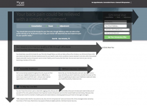
Known as the “F” pattern, this is often considered the most natural way the eye moves across the page.
With few exceptions, you should be drawing your readers attention from left to right with a view to them taking some deliberate action on the site. Don’t annoy your site visitors by causing their eyes to move up and down or right to left unless it is absolutely necessary.
5. Limit the Choices
Don’t burn your users with too many options. The human brain tends to remember between 5 to 7 pieces of information at any one time. If you want to boost your conversions, then ensure your web design limit the number of choices.
This rule of thumb, also known as “Hicks Law“, (after British psychologist William Edmund Hick), “states that the time it takes for an individual to make a decision is directly proportionate to the possible choices he or she has.”
To put it negatively, if you want to slow down and decrease your site visitors the ability to make decisions, simply increase their choices. In designing your website, you want to do the exact opposite. You want to limit the number of choices so that the site visitor will speed up their decision.
Job is to help your site visitors to make a decision and act on it. One of the best ways you can move your site visitors to make positive choices is by limiting the number of options.
Limiting the number of options you give to a visitor has been shown to produce better rates of conversion consistently. Whether you’re creating blog content or a landing page, take the time to check your content for the number of decision points it contains.
Ask yourself the question, is it possible to reduce the decision point on any one page right down to two – or even one?
It’s tough to maintain site visitor Focus, but it’s very easy to lose it. And, once lost, it is near impossible to get their interest back. People just don’t hang around on websites long enough.
To counter that, Be sure to follow the rules that constitute an influential call to action as well as design rules such as Hicks Law. Again, you can counter user impatience and user limitations by limiting the number of choices you incorporate into your web design.
6. Minimise Site Activity
Good web design is a design that enables users to get the information in the shortest number of steps possible.
In addition to minimising site options, your design should also reduce the amount of activity required by the user and going on within the website.
Let’s deal with the amount of activity going on within the website first.
Here are some questions you can ask yourself:
- Does your website really need animated GIFs?
- Require falling snow?
- Truly benefit from intrusive pop-ups?
- Are you confusing site visitors with the sheer number and variety of colours, fonts and formats?
All of this adds up to distracting and often pointless busy work on the site. “Remember the adage, “less is more”. Secondly, you want to reduce the amount of activity that a user is required to take in order to reach your conversion goal. The issue here is simplified navigation and minimal steps to accomplish any given task. So, don’t bury your most crucial content beneath three clicks. Your most important content should obviously be front and centre.
Whether you are running an e-commerce website or a consultancy, sit down and count the number of steps it takes any user to complete a conversion goal.
For a service website, it should be no more than 3. An e-commerce website, I would say five is bordering on too many steps. Don’t make you a user’s work hard to convert. Remove all obstacles that might interrupt a conversion path. It’s so obvious that it goes without saying, but this is going to impact the number of conversions you have on your website.
Your web design should be built with a view to making conversion as easy as possible. Strip it back.
Apart from anything else, this is just showing respect for your site visitors. People have become less and less patient, and you need to accommodate that, for better or for worse, in the way you design your site.
7. Incorporate Color Psychology
It is all well known that color stimulates our emotions. Color can inspire confidence, aggressiveness, excitements, happiness, confusion, or even sadness. The same holds true for colors in marketing, as reflected in the spending patterns of just about everyone you know.
Whether it’s fast food impulse red or budget shopping blue, color impacts our buying decisions on a daily basis. 
Use color wisely: To brand and to motivate your site visitors to convert.
Not only should you consider the use of color and incorporate color psychology into the design of your website for the sake of eliciting positive emotions of loyalty and trust. You should be using color to increase brand awareness. Brand awareness can be just as important to site conversion as anything else.
Numerous studies have also confirmed that different color palettes appeal to different users in different ways. The professional website design companies and web designers know how to utilize the psychology of color to grab attention. Elicit trust and motivate positive buyer outcomes.
Most of this is intuitive. Nobody needs to be told that the website of a make-up artist benefits from soft pinks, earthy skin tones, and deep reds.
There is a reason why the finance sector uses blue, and McDonald’s, Coca-Cola and Red Bull use red.
However, this can sometimes be forgotten. When we ignore the end goal and the target audience, it’s easy to slip into unorthodox patterns when it comes to color in the design. The result is typically confusion for the site visitor.
Conclusion
As a concluding rule of thumb, you willing to compare what you’re doing with the success of those in your industry. Be prepared to order your site based on the seven principles on a regular basis. The technology surrounding web designer changing all the time but these principles do not change. Incorporate them into your web design and development and more likely than not you were going to see a boost and website visitor conversions.
——————————————————————————————————————————————————————– DragDorp is a visual drag and drop page builder and editor. It is the only editor universal to any CMS – you can use it to build pages on any system.
It comes with 75+ ready Landing page templates and is often used by marketers to solely build and publish Landing pages quickly and easily – hosted on DragDropr high-speed servers, or on users servers.
Try it now for free, register here and publish your Landing page today!
Leave a Reply
Want to join the discussion?Feel free to contribute!