4 Amazing Landing Page Examples for Higher Conversions
When it comes to creating the best landing pages, businesses should find the perfect combination of elements to capture their potential customer’s attention and get them to take a trip down conversion lane.
Since modern consumers are frequently distracted by homepages, the need for well-crafted landing pages that focus on a single CTA and are as straightforward as possible is a digital marketer’s secret weapon.
Now you may wonder why landing pages are so special.
Can’t I just increase my conversion rate with my website?
Well, to be frank, as modern consumers’ attention span gets shorter and shorter with the average web user reading only 28% of the page per visit, the need for pages with targeted content and a powerful CTA is your top priority.
As one of the best lead generation tools out there, landing pages must be smart, informative and easy to digest.
So, before we see some of the best examples out there, let’s take a look at the definition first.
What are Landing Pages?
In digital marketing, landing pages are standalone pages that are specifically created for a single purpose.
This purpose can vary depending on your business and set goals.
While there are numerous landing page examples out there, the majority of them focus on capturing a visitor’s contact details and motivating them to take a call-to-action.
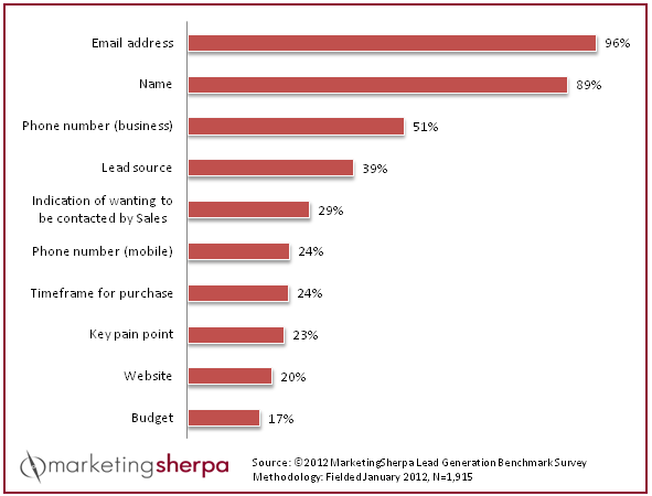
According to MarketingSherpa, 96% of marketers claim that emails are the most important detail a landing page must be able to capture.
For your visitor, landing pages can easily minimize distractions and offer them a CTA they won’t be able to resist.
As for the marketer, creating them is pretty simple as the only thing you need is a great landing page builder and a landing page idea that will convert your visitors.
Landing Page vs Homepage
To understand the key difference between homepages and landing pages take a look below:
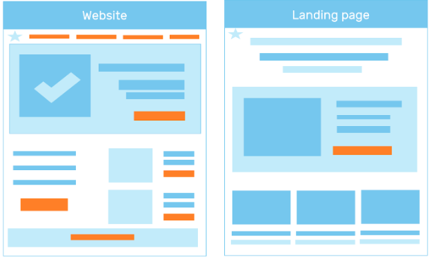
As we said before, websites can distract your visitors with their multiple CTAs and fancy pictures.
So, if you want to increase your conversion to higher heights, you shouldn’t use it as your primary means of winning more customers.
According to Aleksandar Stanisic, “if you simply direct the visitors to your homepage, they may not know what to do from there. You will leave them with too many options, so they may just give the site a quick look and bounce. However, if you lead them to a landing page, they will know what specific action you want them to take.”
If you’re looking for landing pages with high conversion rates, then you should focus on highlighting the value of your offers without getting your visitors to click on multiple CTAs.
Now Let’s See 4 Landing Page Examples To Skyrocket Your Conversion Rate
To improve your landing page conversion rate, you should first choose the best types of landing pages and equip them with the elements that will attract your visitors’ attention and make them click.
While designing a landing page with a drag and drop editor can be an easy task, determining the right elements can be a tricky part.
To gain some insight, here are some great examples and their secrets to achieve higher conversion rates.
1. Shopify
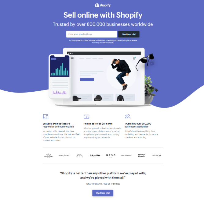
The first landing page example comes from the eCommerce platform Shopify.
If we look at it, we’ll see that this page has one of the best element combinations that make Shopify’s CTA irresistible.
To see why this is an exceptional landing page, let’s analyze every element from top to bottom.
First of all, this landing page combines a consistent minimal design with great visuals that make the page appealing.
The lack of a navigation bar also minimizes distractions by limiting the number of CTAs the visitors see on the landing page.
Regarding the copy under the CTA box, Shopify manages to highlight the company’s easy-to-join and no commitment character.
![]()
Let’s be honest, no-one likes adding their credit card information if they aren’t going to buy something.
And if they do, there is always the fear of getting charged without realizing it.
By allowing your visitors to try your product without any commitment you have greater chances of getting them to add their contact info since the fear of getting charged in out of the picture.
Now, the next thing that Shopify adds to its landing page is the element that helps visitors understand the value of their product.
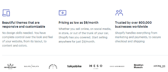
Shopify gives three compelling reasons why visitors should sign up, highlighting the advantages of their platform, its cost-effective character and the number of businesses already using it.
Since we tend to be influenced by numbers, Shopify’s customer count turns the trial into a unique offer every potential customer should try.
And to make their customer count a lot more convincing, Shopify lists some customer logos to add credibility to their page.
The last thing visitors see before Shopify reminds them to start their free trial is a quote from an existing customer.

This testimonial is strategically placed before the CTA box to add more value to the product and highlight the importance of trying it.
By putting all these elements together, Shopify has come up with an amazing landing page that gives visitors all the right reasons to join and enjoy the platform.
2. Salesforce
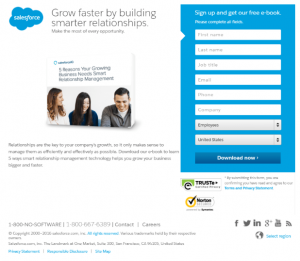
Salesforce has another great landing page example that has all the necessary elements to make the visitor download their e-book.
Apart from the visual elements like the image of the e-book on the left side, Salesforce uses their brand colors to deliver a balanced landing page that is easy to digest.
While you might consider this to be the least of your worries, even this little detail as the choice of color can influence your landing page conversion rate.
Regarding the value of the landing page, Salesforce uses specific words to get the message across: “learn 5 ways smart relationship management technology helps you grow your business bigger and faster.”
If you pay a closer look, the highlighted words summarize the benefits of downloading and reading the e-book without getting into a lengthy summary of the chapters.
Using the right copy plays a major role in the success of a high converting landing page.
However, there is another crucial element that will, eventually, determine whether the visitor downloads your e-book or not.
You can spot this element in the form of two trust badges under Salesforce’s submission form.
These trust badges are the perfect addition to increase your landing page credibility and reassure your visitors that it is safe to share their personal details with you.
Credibility is a crucial element that can influence your visitors’ online behavior, so if you want to increase your conversions you should let them know that your page is safe.
3. Klientboost
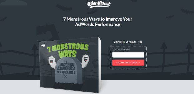
Klientboost has an exceptional landing page that, if you are checking it during Halloween, it gives you more reasons to click and get their “monstrous” guide.
At first glance, Klientboost’s landing page relies on visuals to deliver a fun visitor experience.
One of the elements that attract attention is the red CTA button that stands out from the rest of the visual elements.
Since red is a powerful color that usually attracts attention, Klientboost’s landing page uses it on their CTA to turn it from a boring CTA box to a powerful click magnet.
Also, the landing page makes sure to provides extra information about the guide right above the CTA to give visitors an idea of what they’ll get when they download the guide.
Now, here’s what comes after:
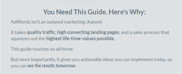
Informing your prospects why they need the guide is one of the most successful landing page techniques that will pique on their interest.
The choice of words highlighted in bold delivers an idea of the benefits the visitor will get after downloading.
And to make things better, Klientboost employs two extra elements to get them to download.
Here’s the first:
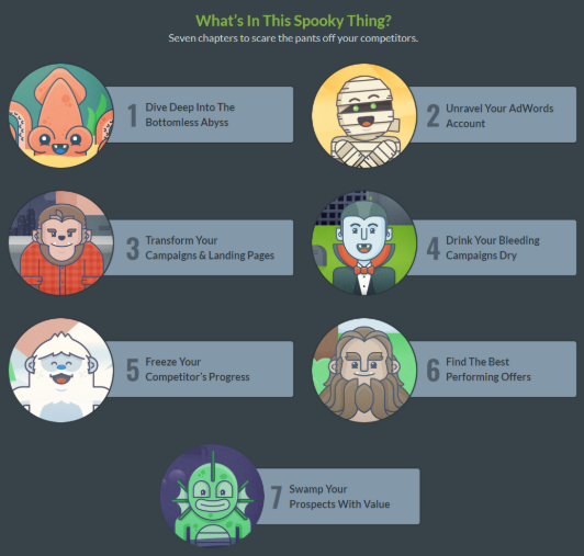
With this mini what’s-in-this-spooky-thing visual and text collab, Klientboost amazes its visitors while staying true to the character and theme of their landing page.
Every chapter is accompanied by a clever monster image that, according to Klientboost, will scare the pants off your competitors.
While the visual elements give Klientboost a huge landing page boost, its creative copy is what manages to fuel visitors’ inspiration and make them click.
And for those who aren’t easily convinced, Klientboost’s landing page has a last trick up its sleeve.
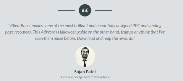
Social proof in the form of testimony from an existing client increases the credibility of the company and powers up the entire landing page.
Finally, to see if this landing page is equally great on other devices, I decided to test its performance on my mobile phone.
As the majority of consumers use at least one mobile device, making your landing pages mobile-friendly is a great way to minimize your landing page bounce rate and increase your conversions.
Here’s how this spooky landing page looked like:
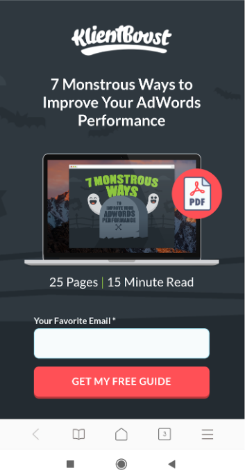
For Klientboost, this landing page is a true conversion winner.
4. Upwork
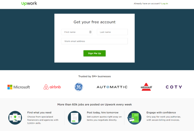
Upwork is a big landing page player.
Can you guess why?
Well, it only features one of the biggest companies out there as part of their existing customers.
While the design might be simple without any background images, Upwork’s secret conversion weapon is its famous customers.
This element shows Upwork’s prospects that since Microsoft and Airbnb have chosen the company, then it is worth it.
Also, by using the number of trusted businesses, 5M+ to be precise, Upwork highlights that their company has credibility and is capable to fulfill every promise it makes.

Despite being on the simple side of landing pages, Upwork has equipped its page with three solid points to show visitors why they should sign up with them.
By highlighting the value of your product and showing visitors that they can trust you, you have an amazing landing page that will convert without being fancy.
As Upwork’s example shows us, your landing page should favor the elements that will attract your visitors’ attention, be concise and present the value of your company and products.
Takeaway
Landing pages are massive tools to drive traffic, improve SEO and build your brand.
What the above examples showed us is that successful landing pages need to deliver a great experience that will make your visitors click on your CTA without hesitation.
To make them work, you should also keep in mind that testing your landing page elements can improve your conversion rate optimization percentage significantly.
So, if you’re currently planning to create new landing pages for your business, take a look at these real examples and use them as a blueprint to create awesome landing pages that will convert.
Author bio

Marilia is a Creative Writer working for email marketing software Moosend. Her passion for writing has made her find new ways to combine the art of Creative Writing with SEO Copywriting. When she’s not writing articles, you’ll find her spending time on her drabbles.


Leave a Reply
Want to join the discussion?Feel free to contribute!