7 Landing Page Trends to Boost Conversions in 2019
Landing pages are one of, if not the most important lead conversion tool in a digital marketer’s arsenal. They drive traffic, improve SEO, build your brand, and boosts conversion. For this reason, marketers spend a lot of time and resources testing and optimizing their landing pages.
In order to truly optimize landing pages, however, they have to be constantly updated. Sure, your landing pages might be converting now, but as consumer tastes change, its ability to convert gradually weakens over time.
But don’t fret. We’ve got you covered. We came up with a list of landing page trends that are definitely worth considering this year so you won’t have to worry about your conversions.
Landing Page Trends 2019
Microinteractions
When it comes to landing pages, most experts agree that limiting the number of things a prospect can do is the key to being effective. In fact, they recommend that your goals and their actions should have a ratio of 1:1 – one action button for them to do what you want them to do. And for the most part, I would agree since it’s a guaranteed way to get your prospect to follow your goal.
But 2019 promises something different as landing pages look to take interactions to another level with “micro-interactions.”
The term “micro-interactions” refer to extra actions that your prospect can perform while on your landing page. These actions are subtle but unnecessary. These actions may be in the form of:
- Confirmation messages
- Hover effects
- Page transitions
- Scrolling animations
- Error messages
Microinteractions can help landing pages improve retention of visitors by adding a variety of unexpected, yet delightful, surprises, which adds a “wow” factor. Adding something as little as a hover effect on your text or a good loading animation can keep your visitors engaged enough to make them stay on your page, and ultimately convert.
As indicated by the name, micro interactions should be kept subtle you don’t pull attention away from your true aim. Keep them small and unobtrusive.

Neo-Minimalism
Minimalism revolutionized the design industry in the early 2010s when it promoted, well, minimalistic designs in lieu of the flashy, and sometimes flamboyant, displays of design that defined the 2000s. Less is more became the mantra that continues to define the 2010s – and landing pages are no different.
Due to the sheer popularity of the movement, many have adopted the mantra. Businesses are now making more of an effort to stand out in the midst of all the minimalistic sites. This new movement, the aptly-named “neo-minimalism”, makes use of even more negative space and even fewer details – and the results are immaculate.
The best thing about neo-minimalism? It’s not only aesthetically-pleasing, but it also gets your message across even quicker, as well as being economical. If you have a strong CTA that converts on its own, consider going minimalist.
Use of Serifs
Serifs are small projections that finish off a stroke on letters, and of course, the fonts that use them. These are typically small lines or symbols located on the end corners of a letter. Letter styles and fonts with serifs have always been popular but with the minimalistic movement gaining popularity over the past few years (see above), designers favored more simplistic fonts without serifs aka sans serifs.
This year, serif fonts are about to rise in popularity again. They add a sense of luxury and class to a landing page design. And in an era dominated by minimalism and sans serifs, serif fonts will definitely help you stand out.
When incorporating serif fonts on your landing page, go for designs that are not too elaborate to still retain some minimalistic qualities. Add them to headers or sub-headers.
And speaking of serif fonts…
Bold Typography
Typography is a design tool that adds designs and styles to the letters themselves. It has always been a popular choice for every designer as they can be used for a variety of designs – minimalistic or not. But this year promises to be even bigger for the typography school of design.
Typography adds personality, evokes different emotions, and sets a tone for your landing page while still promoting your offer. Use big, bold letters for your design. As stated before, use serifs for your headlines and sans-serifs for the body to create a dynamic parallel. Let your design do the talking and improve visitor engagement.
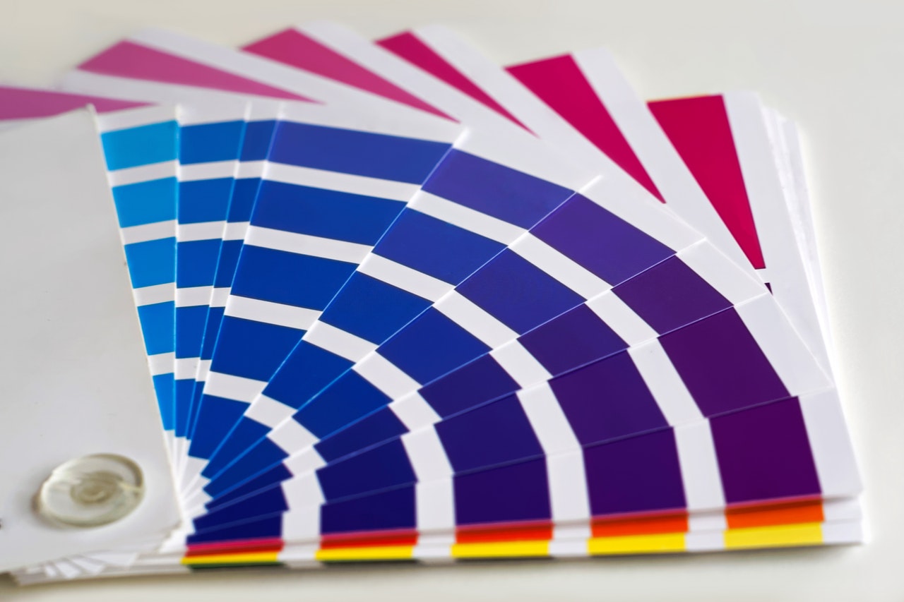
Vibrant Color Schemes
Gone are the days when web-safe colors were a thing. Supersaturation and vibrant colors are taking over the landing page scene. Vibrant colors make it easier to capture and retain, the attention of your visitors. When combined with the right texts, designs with vibrant color schemes are sure to boost conversions.
Aim for designs that deliver high contrast between background and text. Use a variety of colors to evoke certain emotions – warmer colors for warmth and joy and cooler colors for calm and peacefulness.
Geometric Designs
The use of geometric shapes is becoming an increasingly-popular design trend. Designs that seek to create a more modern and futuristic look are now incorporating grids, lines, regular shapes, and abstract shapes. There is one drawback, however: geometric designs tend to be cold and lifeless.
In order to counter these drawbacks, designers make use of warmer colors and are incorporating more curves to create a more “welcoming” vibe. This makes it possible to create a design with futuristic appeal without becoming imposing.
When using abstract shapes, soften the edges a little bit using rounded corners. Add curves to otherwise straight lines. Lastly, use warm, vibrant colors on the page’s background or for the main elements.
Drop Shadows
Flat designs initially became a thing during the late 2000s but gained much popularity in the 2010s. And basically, every designer made sure to incorporate flat styles in every landing page design.
Now, pseudo-3D designs are becoming a thing. Drop shadows are now being used to create a 3D effect on flat designs and give landing page elements more depth – it gives an illusion of added layers to a page. Soft shadows increase the visual appeal of visual elements, and ultimately the entire landing page. They help improve the user experience, providing emphasis to certain elements, and helps the retention of visitors.
Final Thoughts
No matter the design need, whether it’s a web page or a landing page, make sure you incorporate the needs and wants of your target audience. Trends are a product of those wants – and they always change.
Some trends may be like fads that disappear for a short amount of time or a prolonged period of time. But the truth still remains – trends come and go. That is why it is very important to keep your landing page look updated while never losing your identity as a brand.
And for your landing page needs, always make sure to use DragDropr so landing page creation becomes easier, and a better overall experience.

Leave a Reply
Want to join the discussion?Feel free to contribute!