How to Create A Minimalistic Website in 2019
Table of Contents
Simplicity is beauty. This classic saying has always been applicable to many different contexts, whether it is in designing a home, putting together an outfit, or even in creating websites. Well, this saying lives on for a reason – the truth about simplicity creating a strong sense of attraction from those who come across it. Who would ever think that this can also apply to website conversions? Yes, you read that right. Because minimalism has become a trend in the design realm, the simpler and minimalist a design is, the more it draws audiences in and the more they are easier to compel to take actions on your website.
Why Go for Minimalism?
Gone are the days when websites were flooded with different elements, such as animations, colors, and fonts, that do not necessarily blend well together. In this age, people prefer websites that are simpler and easier to understand without being too plain. Thanks to the concept of minimalism, the world of web design have given birth to something less complicated yet still aesthetically pleasing enough to draw in a crowd (and hopefully, paying customers).
In designing websites, minimalism is done by creating a simpler interface through eliminating objects or elements that are excessive and irrelevant. Beyond the surface level of just making websites more beautiful, minimalism actually delivers several other benefits. Here are some reasons why you should consider having a minimalist website if you do not have one yet.
Increased Responsiveness
People now live in a multi-device world that makes everyone easily connected with each other. If we are not facing our laptops or computers, we are on our mobile devices, such as our smartphones or tablets. This is why it is very important for websites to be flexible enough to appear correctly and responsively on the different devices that everyone has.
By Kuba Zelichowski
The UI should be consistent no matter which device your audience uses. A minimalist website enables you to deliver this kind of consistency to your web visitors. Because minimalism entails straightforwardness, the less likely your website will display issues on the devices of your audience. This being said, having a minimalist design allows your website to have better responsiveness on multiple devices, thus, increasing website performance no matter what device your audience uses.
More Focused on Message and Offerings
More often than not, you web visitors would highly prefer it when you, as a business, are direct to the point. A cluttered website would only confuse your audience and they can easily feel lost in the middle of all the unnecessary accessories it has instead of understanding what your business is all about.
by Shinas P on Dribbble
Having a minimalist website will let you keep only the elements that play an important role in highlighting your value proposition and the products/services that you are trying to sell. Once people have a clearer grasp of your business, the likelier you are to convert them into customers or subscribers. Because of this, you should leave no room for wordiness, irrelevant stock photos, and unnecessary graphics fillers.
It’s Here to Stay
The thing about trendy website designs is that they usually go out of style after some time. With this, you would have to constantly make updates to cater to the changing preferences of your audience in design. With this constant updating, you are actually losing precious time that you could have spent in creating stunning graphics or enhancing coding expertise.
Meanwhile, minimalist web designs are timeless and will not be outdated anytime soon. Not only are they elegant, but they are refreshing to the eyes. When your website is easy to look at, it gives audiences the impression that your business exudes confidence in itself. It tells everyone that you do not have time for beating around the bush and that you truly mean business.
Ways to Create a Minimalistic Website
The “art of less” actually requires a lot of thought than you may perceive. It is not just throwing together plain text and simplistic elements, but it is creating with several principles that you must keep in mind. Minimalism calls for the following:
- Negative spaces and no excessive elements
- Friendly UI
- Complementary colors (three, at max)
- Getting creative with fonts
Now that you know the basics to keep in mind, here is how to create a minimalistic website that will help you skyrocket conversions.
Integrate Empty Spaces
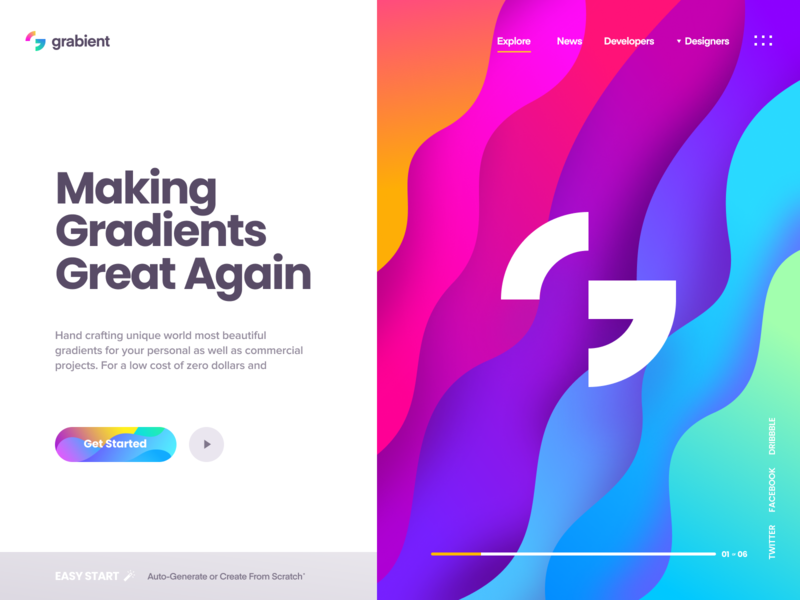
Empty spaces, more appropriately known as “negative spaces” in the design world, are integral components of minimalism. They refer to the gaps between parts of a composition. Integrating negative spaces in your website fosters balance in the design. The balance that they add helps in capturing the attention of your audience and enables them to concentrate on your content and offerings. Negative spaces make your website more comfortable to look at. As a result, your audience will be more encouraged to linger on your website and scroll more to see your content.

Nutrition UI by Giga Tamarashvili
Add Bright Colors, Typography, and Carefully Selected Graphics
Bright colors add more life to everything, and this includes your website. Just because we are talking about minimalism doesn’t mean that your website should be monochronic and boring. Adding pops of bright colors on your website design gives it energy. However, do not go crazy on the colors as we are still aiming for a minimalist design. Combine these colors with complementary, cool hues, along with white or black typography in order to still achieve a sense of balance in your design.
Moreover, you need to be more selective in your website’s graphics. Go for high quality images that resonates the values and messaging that your business wants to portray. They have to evoke emotions out of your audience. Pictures do speak a thousand words so make sure that they relate to what you are trying to showcase as a brand.
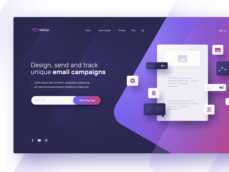
Showcase Your Value Proposition
Right from the moment that your audience lands on your website, you need to take advantage of those few seconds to seize their attention and deliver the value proposition of your brand. For this reason, it is very important to not have any distractions, especially on your home page. This is the perfect time for you to emotionally connect and initially engage with your prospects which is why the message you portray in the beginning should be central to your brand. Forget about excess distractions, like unrelated call-to-actions, extra pictures, pop-ups, and wordy descriptions of your website. The real key here is focus – once you do this, you will be able to make prospective customers have a solid grasp of what you are all about.
Build Easy Navigation
Minimalism is not just about having a website with simple and straightforward designs. It is also all about ease of navigation and user-friendliness. Your website needs to be convenient for your audience to explore and they should be able to easily find what they are searching for. In other words, design your website in a way that it is not too complicated. It has to be at optimum usability or intuitive. For example, when a website visitor wants to see more of your offerings, they should be able to find where they are without having to go through or click so many links or lists. Most importantly, your call-to-action buttons need to be on-point and strategically placed. The more that they are easy to find, the more conversions you will be able to have.
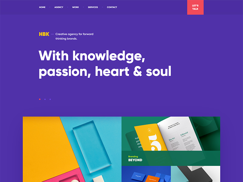
HBK / Creative Agency by Mike | Creative Mints
Linking Minimalism and Conversions
Minimalism is a way to let your audience easily understand your value proposition and the products and/or services that your business is offering. It gives way for better emotional connection from your audience and helps you build stronger engagement with them. When your audience knows how to go around your website and has a clear view of what you are as a business, it will be easier for you to convince them to buy from you or subscribe to your mailing list. Less is indeed more. Encourage conversions with a minimalistic design, put greater focus on aspects of your business that matter more, and watch it grow!
DragDorp is the only editor universal to any CMS – Magento, Shopify, Lightspeed, WordPress, and others.
It can be used with any HTML editor to help you build pages visually.
It comes with 75+ ready Landing page templates you can use on any CMS!
Try it now for free, register here and publish your slideshow today:)
Leave a Reply
Want to join the discussion?Feel free to contribute!