
Gill Andrews Interview: Website Optimization Tips & Tricks
In today’s digital age, your website is your digital storefront. – it’s what new visitors evaluate in order to determine whether they want to buy something from you.
According to a recent study published by Sweor, it only takes 0.05 seconds for users to form an opinion about your website. In addition, 38% of people will stop engaging with a website if the content or layout is unattractive.
For this reason, our team at DragDropr got in touch with Gill Andrews – a copywriter and a web consultant who turns underperforming small business websites into slick lead-generating machines.
In this interview, we’ll talk about the following topics:
– What’s the anatomy of a perfect website
– How to capture and convert leads
– What are the key elements of a landing page
– How to design your eCommerce homepage to land the first sale
Without further ado, let’s crack straight into it. 🙂
1. So Gill, can you tell us a little bit about yourself? 🙂
I’m a copywriter and web consultant. I work with small and medium businesses helping them improve design and copy of their websites to sell more.
I used to work as a software engineer and IT consultant, but decided to switch careers 5 years ago. I spent the first two years learning everything I could about copywriting, web design, user experience and conversion optimization.
I officially went freelance 3 years ago and never looked back.
2. What’s your most favorite part of being a copywriter and a web consultant?
Learning about different products and services I otherwise may not have come across and seeing the difference my work makes in people’s businesses and lives firsthand.
3. What are the most exciting projects and campaigns that you’re working on at the moment? Could you share some new strategy/hack/trick you are using in that project/campaign?
The most exciting projects are always the personal ones, and publishing my own book “Making Your Website Work” has been certainly the most exciting project so far.
As for the client projects, the most exciting ones are always the projects that:
- Have the right client – someone who understands the value I bring to the table and the complexity of the factors that influence conversions
- Provide enough data to work with – enough customer feedback to make solid assumptions about their target audience’s problems and needs, and the words they use when they talk about their situation and the product
- Have enough website traffic to objectively test the changes
Regarding the hacks and tricks, I don’t like this wording, to be honest. It doubles down on the deceiving narrative many blog posts on conversion optimization: “Just use these 5 tricks, and your conversions will skyrocket.”
But the reality is, you can’t make a page / website convert better just by reading a couple of blog posts with some tips and hacks.
You need to do the work, often hard and meticulous work that has nothing in common with the easy-breezy activities those tips and hacks promise you.
Just look at the minimum you have to do to make just one page on your website convert better:
- Interview the business owner / their team to find out more about their business model, current struggles and results they expect
- Conduct an in-depth analysis of a target audience analysing customer survey results, chat logs, interviews, etc.
- Analyze current user behavior on the page by looking at session replays and Google Analytics data
- Develop a hypothesis based on the insights you won from the analysis
- Develop a strategy as to how to work that hypothesis into the new copy and design
- Write and design the new page (notice that it’s a second last point on this list)
- Test it and most probably tweak it further
With a website, it’s even more complicated, because then you aren’t analyzing just one page but the whole funnel.
This process has very little in common with tips and hacks, but that’s what really works.
Sure, somewhere down the road – for example, when you’re testing the page – you get an idea to place a CTA button lower on the page, because you suspect the prospects don’t have enough information to commit yet, and this may look like a trick to you. But even that is based on an assumption that resulted from data analysis.
So, tips and tricks make great blog posts, but not so great tools when you want to actually make things work.
4. 88% of online consumers are less likely to return to a site after a bad experience. How does an ideal website look in the mind of Gill Andrews?
The ideal website is the one that:
- easily lets the visitors complete their tasks (find an answer to a question, discover more info about your services, find your opening hours, etc.)
- but at the same time makes them do what you want them to do (sign up for your list, buy your product, reach out for a quote for your services, etc.)
The concrete ways to achieve that depend on your business model, target audience and a dozen of other things.
But in most cases, websites that work better than others fulfill the following criteria.
The design of an ideal website:
- Is 80% prototypical to your niche and 20% different from your competitors so that it will stand out and be remembered
- Is pleasant to look at, with enough white space not to seem cluttered
- Uses proper visual hierarchy that supports skim-reading
- Doesn’t interfere with your message and lets people absorb the info in peace
- Supports easy completion of visitor tasks
- Looks great on all devices
Its copy:
- Is written by a professional copywriter (and not by your salespeople or John from accounting)
- Answers these questions on the homepage within 5 seconds:
- What is it and from whom?
- How does it help?
- Why you and not your competitor?
- Is clear in every single line, from reassuring your visitors that they came to the right place with clear copy in the header to clear navigation labels, subheads and CTA button copy
- Addresses the reader as “you”
- Uses clear words that 100% of your target audience understands
- Is specific – uses words that make your prospects imagine concrete things
- Mentions real benefits that your audience truly wishes for
- Addresses objections and reservations
An ideal website is also fast, error-resistant and accessible to people with disabilities.
5. A recent study by Google states the simpler the design, the better. How should a new eCommerce store design its homepage to close the first sale?
In 2018, it was taking people about 20 days on average to decide whether to buy a product after the first time they googled for it.
So, a homepage alone can’t be responsible for closing a sale, not to mention that a sale is usually closed on a product / checkout page.
But a homepage can be a make-or-break factor and either impress your prospects and make them remember you so that they’ll come back to you when they’re ready to buy, or to make them leave quickly and never come back.
As to the design, it should fulfil all the criteria I mentioned regarding an ideal website.
I wish the companies would pay more attention to the copy than to the design of their homepages, though.
It’s great that you’re trying to delight your visitors with animations and super modern design features. But if:
- the words on that page don’t explain clearly what your product is good for and why a prospect should buy from you and not your competitors
- your huge images deliver no value and unnecessarily bloat your page
- your extensive animations are distracting and make it difficult to navigate your site, etc.
…it may look pretty, but it may be harmful to your sales.
6. How many CTA buttons should a homepage have? And do they all have to be the same?
You can’t design a homepage around only one call-to-action button, because you can’t predict where a visitor who lands on your homepage came from and what she wants.
Has she found you through search via a query that indicates strong interest or from a post on social media that just sparked her curiosity?
Has she visited your website before and is now ready to make the next step or is she a first time visitor?
So, you need to anticipate the needs of the different segments of your target audience and their stages of awareness showing each of them the way to the relevant pages with multiple sections and different CTA buttons to your homepage.
But cluttering your homepage with all CTAs you can possibly think of is another extreme you should avoid not to clutter the page, overwhelm your visitors and cause decision fatigue.
To determine what CTAs to put on your homepage, use this 4-step process:
- Take a pen and a piece of paper and write down the CTAs that would make sense to have on your homepage based on your audience segments and their needs.
- Color each CTA red, yellow and green based on how difficult you think it will be to persuade your visitors to take an action (i.e. based on the level of commitment).
- Arrange your CTAs from top to bottom based on how valuable a click on that CTA is to you (see the image below).
- Decide what CTAs to keep based on the following rules of thumb:
-
- No more than one CTA button should be visible simultaneously on one screen view (unless it’s products or services CTAs)
- The higher the level of commitment that an action requires, the more compelling your copy needs to be
- Before asking for a click on that button, you should always make sure to provide enough information / reasons for a prospect to want to do that
- When they click on that CTA, it means they’ll leave the current conversation and may not come back. Make sure not to let them leave too early, before you told them the minimum info you wanted them to know about you and your offer.
The image below illustrates this process for a service provider.
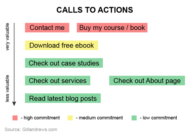
(Source)
7. What are your most favorite ways of capturing leads on your website?
The times when people would get excited about downloading a simple free ebook are over.
To stand a chance, your lead magnet needs to be targeted, ultra helpful, easy to consume, actionable and really impressive – certainly not something people could found openly available just by googling.
So, that’s what you have to get right first.
As to capturing the leads on my website, there are two ways I use to get new subscribers every day without any additional effort from my side.
As a website user, I can’t stand popups or any other kind of interstitials. So, I don’t use them on my website either. And even if I were to use them, I think they would only harm my business, because I don’t have enough traffic to make up for their drawbacks.
So, I found the most effective ways to get people to sign up for my list to be:
- A dedicated page for each of the lead magnets that also rank in search for the queries that indicate high interest in the lead magnet. This way it’s not hard to persuade people to download the resource, because that’s exactly what they want in the first place.
- Linking to those ultra-useful lead magnets from popular articles that deal with similar problem as a next step to solving that problem on the spot.
With these two techniques, I get about 1 subscriber out of every 50 website visitors.
8. One of the most effective ways of boosting conversions and leads is through landing pages which send the visitor directly to your lead magnet/opt-in offer. What are the key elements of a highly converting eCommerce landing page?
First, a high converting ecommerce landing page should match all the points regarding an ideal website from one of my previous answer.
Additionally, since you wrote that page with a very specific audience in mind, you need to make sure that the content of the page matches their state of awareness and takes them from the place they are at now to a place they need to be to convert.
You do that with clear, relevant and valuable copy that leaves no questions unanswered.
It’s not about offering options to different segments of your audience but about an argument that you shape to persuade your prospects to buy.
Two things that often get overlooked: Countering objections and proper use of social proof.
Your prospects will have doubts, reservations and anxieties. Your job is to identify them in advance and counter them within your copy.
As for social proof, it needs to be specific to work, describing original problems, talking about specific results (if possible, supported by numbers), showing that a fear wasn’t justified, etc.
If you have vague testimonials that only say “this is a great product, I recommend it”, I won’t even count it as social proof.
And of course a high converting landing page usually has only one call to action and no other links that take your prospects to a different page.
9. Most of the digital marketing experts would agree that lead conversion should be your #1 priority. 96% of visitors to a new website aren’t ready to buy anything (yet). How does an ideal eCommerce sales funnel for a physical product look like?
It really depends on your business model, your product and your target audience.
What did your lead sign up for – a discount coupon, a free trial, or an email newsletter?
Based on the page they signed up on, how close are they to giving you their money?
Did they leave you a lot of data about themselves or is an email address all you have?
So, there is no one-way-fits-all solution.
But there is one key element all those scenarios will have in common: Email marketing.
You can’t just abandon your leads after they gave you their email addresses. Sending them random emails once in two months won’t work either.
You need a thought-through email marketing strategy of how to convert them into paying customers, and you need to regularly appear in their inboxes before they’ve forgotten about you.
I’m not an expert on email marketing strategy though, so I don’t have any particular tips here.
10. Many web consultants struggle to convert visitors into clients. What’s the secret recipe for creating a ’killer’ service page that would skyrocket conversions?
When your prospects land on your service page, they have many different questions:
- What is it?
- How does it help?
- Will it really solve my problems and deliver the results I want?
- How much does it cost?
- What if I’m not happy with the results?
…and so on.
So, they want answers.
And your job is to offer them those answers in a clear, valuable and engaging way so that even if they aren’t ready to hire you now you’ll be the first person they’ll think of once they are ready.
The question is, how to do that?
You may have heard of an inverted pyramid principle – a way journalists order the info in their articles based on its importance, providing the most important info first.
I like using a similar approach to structuring service pages. I call it “the biggest deal breaker principle” – a way to structure your page not to keep the visitors on it longer but to try and get the people who aren’t a good fit for your offer to leave the page as fast as possible.
For example, services title is the most important deal breaker, because if someone’s looking for a web designer and you’re a product designer, they wouldn’t want your services even if they were free.
Fees are an important deal breaker, but not as important as the benefits and results your service delivers. You may even convince a prospect to pay a higher price if you offer strong proof that the benefits they’ll get from your service are worth it.
The exact page structure will vary from business to business, but the following image illustrates how an effective service page could be structured based on the biggest deal breaker principle.
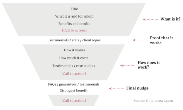
(Source)
The design of the page should support skim-reading and use subheads effectively to help people understand where they could find what info so that they can dive into the relevant section faster.
The copy should fulfill all the criteria I mentioned in my answers about an ideal website and a high converting ecommerce page with the only difference that you’ll need to talk more about your process and yourself.
Hiring someone is riskier than buying a physical product (you can’t just send a bad web design back or return a copywriter at no cost).
So, your process and your personality is a part of a “product”, and you have to reassure your prospects that you’re a likable and reliable professional who has a clearly defined process by adding corresponding info to your service page.
11. Getting traffic to your website is great, but if that traffic doesn’t convert, it’s almost useless. What are the key metrics to focus on when analyzing and improving a website’s conversions?
The most easy-to-spot reasons for low conversions are having a lot of traffic to a page that doesn’t sell anything or attracting the wrong people to your sales page.
To see if that’s the case, check the Google Analytics reports for the overview of the landing pages and the source of traffic to a page that should actually convert well.
If you see that the audience that comes to the page should actually convert, start your analysis by looking at the following:
- Bounce rate / page load speed on different devices (maybe your page has layout / load speed problems on a popular device)
- Heatmaps to get the big picture of how far they scroll, where they click and what sections they skip / read attentively:
- If the majority doesn’t scroll far, your copy probably fails to reassure them that they came to the right place, and your page seems irrelevant to them.
- If the sections that you were hoping they’ll read attentively don’t show much cursor movement, it means they are scrolling past them and miss important parts of your argument.
- Session replays in general paying attention to the sessions that indicate a problem you’re trying to solve. For example, if bounce rate is high, look at the sessions between 10 and 30 seconds to understand why people bounce so quickly.
- Navigation paths (if you’re analyzing your homepage or a page with multiple links to other pages) to see what pages they check next and whether it’s consistent with your expectations.
12. Running a newsletter is an integral part of capturing leads and staying engaged with your followers. Could you recommend a few creative lead magnet ideas for boosting the newsletter sign-ups?
I think literally any lead magnet will resonate with your audience if you manage to show them that this is something that will solve a burning problem in a simple way or deliver some exclusive info they won’t be able to get otherwise.
I see the following lead magnets work well:
- quizzes
- free mini courses
- templates
- in-depth resources that solve a problem that’s difficult to solve otherwise
13. What are your favorite tools and apps that you cannot survive without?
I don’t use many apps, because they could really distract you and waste your time with things that aren’t that important to your business. So, these are the only apps / free tools I use:
- Buffer to schedule my tweets
- Bulkbuffer to bulk-add the tweets to Buffer
- DocuSign to let my clients sign contracts without printing them out
- Calendly to make it easy for my prospects to schedule a call with me
- CapitalizeMyTitle to help me properly capitalize my page titles and subheads
14. The best way to predict the future is to invent it. How do you envision yourself in the next 10 years?
Having written a couple of more books. Having launched a course. Taking longer vacations.
15. Thank you so much for taking the time to do this interview. But before you go, do you have any other final tips for upcoming web consultants and copywriters? 🙂
It’s hard to give any tips here, because the only situation I’ve ever been in is my own. And switching careers, living in a non-English speaking country and never meeting my clients in person is not exactly what you call a typical situation.
I can only tell you what I did to improve my skills, to grow my business and to make sure my work brings me joy, which is:
- Spending a lot of time learning and reading countless articles from ConversionXL, Copyhackers and Orbitmedia while making notes on a piece of paper by hand
- Having a clear strategy as to how I’m planning to attract new clients (on autopilot via content marketing)
- Investing time and effort in content marketing, writing my articles with a goal to cover a topic better than any other article out there and not just regurgitate someone else’s ideas
- Having enough patience and focus to keep following my plan, even if the initial results were slow
- Not doing things I don’t feel comfortable doing, even if others swear they work (adding popups to my website, cold emailing, link outreach, etc.)
- Not being afraid to have a voice and an opinion
- Knowing my own worth and not being afraid to say “no” to projects and people to protect my own interests and sanity
- Always learning


Leave a Reply
Want to join the discussion?Feel free to contribute!